Good Housekeeping Institute
Renewal of the GHI website to be fully responsive website and launching new business paywall for the product reviews. Only paid users can see some of the 'Tried and Tested' content. I was working as a product designer, providing UX wireframes and collaborating with the engineering team and product manager. Main task was organising the vast amount of product categories while also needing it to look simple for user to find their point of interest quickly.

Product Review
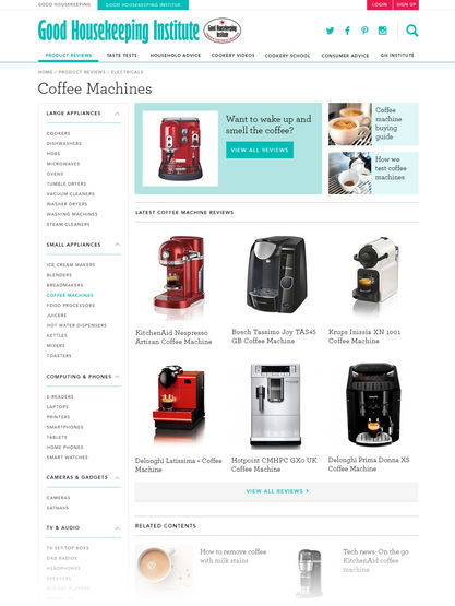
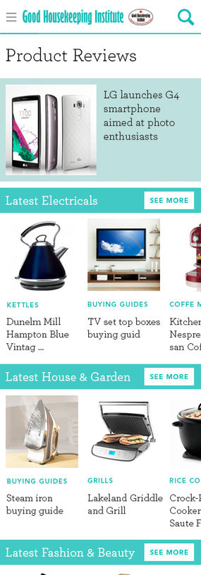
We tried 2 different user journeys; a user just browsing or a user who has a specific product in mind. Our solution was using the listed style design on the main page. Most popular products were listed on the first landing page. Sub category names were tagged along with product thumbnail images so that users can browse the website without needing to click the main menu.

Use dropdown list menu for organising categories; effective use of space on mobile. Once the user chooses the category of products, the filter system becomes the main navigation to compare products and details.
Paywall contents
Users who paid for subscription can access the GHI expertise reviews and user can compare the product scores.
Subscription
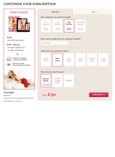
Good housekeeping magazine subscription both digital and print.


